What Is a Design System? A Business Owner’s Plain-English Guide
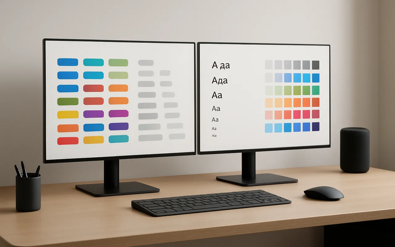
If you commission websites or apps for your business, you’ve almost certainly heard the phrase “design system” from your development team. Most explanations assume you already know what a token is, or why a component library differs from a style guide. This guide skips the jargon. By the end you’ll know exactly what a design system contains, why companies invest in building one, and — critically — whether your project actually needs one right now.
The One-Sentence Definition
A design system is a shared library of reusable UI components, design tokens, and usage guidelines that gives every team member — designers, developers, marketers — a single source of truth for how a product should look and behave.
It’s worth being precise about what that means in practice, because three closely related terms often get confused:
- A style guide is a document — rules about colors, typography, and tone written on paper (or in a PDF). No components, no code.
- A component library is a collection of coded UI building blocks, but usually without the usage documentation or token layer that ties them together.
- A UI kit is a set of Figma or Sketch files — design-side only, with no coded counterparts.
A design system can include all three, wired together so that a change in one place propagates everywhere automatically. That last part — the propagation — is what distinguishes it from a collection of files.
What Lives Inside a Design System?
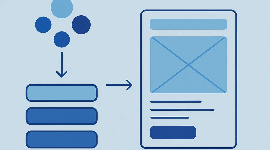
Think of a design system as having four layers, each building on the one below it.
1. Design Tokens
Tokens are the atom layer: named variables that store visual decisions. Examples: color-primary: #2563eb, spacing-md: 16px, border-radius-sm: 4px, font-size-body: 16px. They live in a single file (often JSON or CSS custom properties). Change one token and every component that references it updates automatically — across web, iOS, and Android if the tooling is set up to share them.
2. Component Library
Reusable UI building blocks — buttons, form fields, modals, navigation bars, cards, alerts, data tables, tooltips, badges. Each component ships with documented states: default, hover, focus, disabled, error, loading. Accessibility requirements (ARIA roles, keyboard navigation, contrast ratios) are baked into the component definition rather than left to individual developers to remember on each screen.
3. Usage Guidelines and Documentation
Rules for when to use each component, what to avoid, copy tone standards, icon usage, motion and animation specs, and accessibility standards. This documentation turns a library of parts into a coherent system. Without it, teams use the right components in the wrong contexts, and the system erodes.
4. Coded Components
The same components, implemented in production code — React, Vue, iOS Swift, Android Kotlin. This layer eliminates the most common cause of product inconsistency: designers work in Figma components while developers rebuild everything from scratch in their own CSS, producing subtle but cumulative visual drift between what was designed and what ships.
| Layer | What it is | Where it lives |
|---|---|---|
| Design tokens | Named variables for color, spacing, type | JSON / CSS custom properties / style dictionary |
| Component library | Reusable UI building blocks with documented states | Figma + storybook / npm package |
| Usage guidelines | Rules for when and how to use each component | Documentation site (e.g., Storybook, Zeroheight) |
| Coded components | Production-ready implementations (React, Swift, etc.) | Git repository / design system package |
Design System vs Style Guide vs Component Library
| Style Guide | Component Library | Design System | |
|---|---|---|---|
| Contains visual rules | ✓ | ✗ | ✓ |
| Contains coded components | ✗ | ✓ | ✓ (usually) |
| Has usage documentation | Partial | Partial | ✓ |
| Single source of truth | ✗ | ✗ | ✓ |
Why Companies Build Design Systems
Before you can decide whether to commission one, it helps to understand the concrete reasons product companies invest in them. Here are the five most common, validated by Nielsen Norman Group’s research on design systems:
- Consistency. Every screen looks like it belongs to the same product, across teams and channels. Users trust products that feel cohesive.
- Speed. Designers and developers stop rebuilding the same button for the fifth time. A new feature that once took two weeks of design-plus-development time shrinks to days when the components are pre-built and pre-approved.
- Accessibility. WCAG compliance is built into each component once and propagates everywhere automatically, rather than being re-audited per screen.
- Onboarding. New team members ramp in days rather than weeks because the system documents not just what exists but why each decision was made.
- Scale. Multiple products or platforms — web app, iOS, Android, marketing site — stay visually cohesive without constant cross-team alignment meetings.
The most widely adopted examples are Google Material Design 3 (governing Android, Gmail, Drive, and Docs), Salesforce Lightning (enterprise B2B, accessibility-first), IBM Carbon (open-source, strong on data visualization), and Shopify Polaris (commerce-specific). Each started as an internal tool before being open-sourced.
When Does Your Business Actually Need One?
Signs you probably need a design system
- More than one designer or developer is working on the product simultaneously.
- You have more than one surface — a web app plus a mobile app, or a product plus a marketing site.
- The same UI elements are being rebuilt repeatedly across features or sprints.
- You’re hearing inconsistency complaints from users, QA, or stakeholders.
- You’re planning to scale the team in the next 6–12 months.
- You’re planning a major redesign and want to avoid rebuilding from scratch again in two years.
Rule of thumb: If you have more than two product team members, more than one surface, or more than roughly 30 distinct UI component types — a design system pays for itself within the first major feature release.
If you’re not yet sure whether your project has hit this threshold, it may be worth reviewing your website development budget alongside the cost of ongoing inconsistency before deciding.
Signs you probably don’t need one yet
- You’re still trying to validate an idea — if you’re about to build your MVP, a design system adds overhead that slows you down before you’ve confirmed anyone wants the product.
- Only one or two screens exist.
- The product is a simple static marketing site with no interactive product behind it.
- The budget is fixed and the scope is narrow — the ROI isn’t there for a single-sprint project.
How to Choose Your Approach
Once you’ve decided a design system is warranted — whether you’re choosing how to choose your web app tech stack or planning a full product redesign — you have three practical options.
Build from scratch
Full control over every design decision. Costly and slow — a usable system from scratch typically takes a dedicated designer–developer pair 3–6 months of focused work before it has enough coverage to accelerate the team. Best for mature organisations with 10+ engineers, a distinctive brand, and long-term ambitions to maintain it as a product.
Adapt an open-source system
Start from Google Material Design 3, Tailwind UI, Ant Design, or Chakra UI and extend it to match your brand. This is the fastest path for most product companies. Component logic, accessibility, and documentation are already done — you’re customising tokens and overriding styles, not building from zero. Realistic timeline: 4–8 weeks to a shippable internal system.
Use your platform’s native system
If you’re building on Shopify, use Polaris. Salesforce product? Lightning. Atlassian tooling? ADS. Adopting the platform’s own design system means free upgrades, native interaction patterns that users already expect, and no reinvention of wheels that the platform vendor has already stress-tested at scale.
If you’re commissioning a web application from an external agency or vendor, ask your web development team upfront which design system they plan to use — and whether they’ll hand it off to you at the end of the engagement. A team that can answer this question clearly is one that thinks about long-term maintainability, not just shipping the first release. For context on what different approaches cost, Figma’s design systems overview is a good starting reference.
Five Reasons Design Systems Fail
This is the part most guides skip. Understanding failure modes is often more useful than understanding the theory, because it helps you ask the right questions before committing budget.
- No single owner. “Everyone owns it” means no one maintains it. Systems without a named owner drift within months as each team quietly diverges to meet their own deadlines.
- Documentation falls behind code. Components evolve, the docs don’t update, and the team stops trusting the system. Once trust is gone, people ignore it and write their own CSS — which defeats the purpose.
- Treated as a project, not a product. A design system is never “done.” The teams that succeed treat it like a product with a roadmap, a backlog, and regular releases. Those that ship v1 and move on find it stale within a year.
- One-sided adoption. Designers use Figma components; developers ignore them and write their own code. The gap between the designed spec and the shipped product widens every sprint, and the system becomes a Figma curiosity rather than a shared source of truth.
- Over-engineered for the team’s size. Building a Salesforce-scale system for a 4-person startup is a classic trap. The overhead of maintaining the system outweighs the speed it saves, and the team resents it.
Real-World Examples Worth Studying
Google Material Design 3 is the most widely adopted design system in the world. It governs the visual language of Android, Gmail, Drive, and Google Docs. Material 3 introduced a dynamic colour system based on user wallpaper, showing how a design system can adapt to personalisation without losing coherence.
Salesforce Lightning Design System (SLDS) is notable for its accessibility-first approach — every component ships with WCAG 2.1 AA compliance baked in. For enterprise B2B products where accessibility is a procurement requirement, this is a meaningful competitive advantage.
IBM Carbon Design System is open-source and particularly strong on data visualisation patterns — charts, tables, and dashboards. Carbon is widely used outside IBM by teams building analytics products who want a rigorous, documented baseline.
Shopify Polaris shows the power of a platform-specific system. Because every merchant-facing UI uses Polaris, Shopify merchants have near-zero learning curve when switching between apps built by different developers. For platform businesses, a shared design system is also a network effect.
FAQ
What is the difference between a design system and a style guide?
A style guide is a document with rules about colors, fonts, and tone — useful, but passive. A design system goes further: it includes coded, reusable UI components and a shared token layer, so both designers and developers work from the same source of truth rather than a PDF that quickly becomes outdated. The style guide tells you what things should look like; the design system makes them look that way automatically.
Does a startup need a design system from day one?
Usually not. Early-stage startups are better served by moving fast with an existing open-source library — Material Design, Tailwind, Chakra — and deferring a custom design system until the product has a stable core and more than one team working on it simultaneously. Over-investing in system infrastructure before product–market fit is a common and expensive mistake.
How long does it take to build a design system?
A minimal viable design system — tokens, 20–30 core components, basic documentation — takes a dedicated designer–developer pair roughly 6–12 weeks. A full enterprise-grade system serving multiple platforms and product lines takes 4–12 months and an ongoing team. Adapting an open-source baseline cuts the lower bound to 4–8 weeks for most teams.
Who maintains a design system?
The healthiest design systems have a dedicated “design system team” or at minimum a named owner with allocated time. Systems without clear ownership drift and die within 12–18 months as the team ships product features without updating shared components. If no one is accountable, no one will notice when the system diverges from production until the damage is already done.
Can we just use an open-source design system instead of building our own?
Yes, and for most companies it’s the right call. Adapting Material Design, Ant Design, or Tailwind UI to match your brand saves months of engineering time. You only need a fully custom system if your brand is so distinctive that adapting an existing one would cost more than building fresh — which is true for a small fraction of organisations. Start with open-source and build custom only when you’ve outgrown it.